
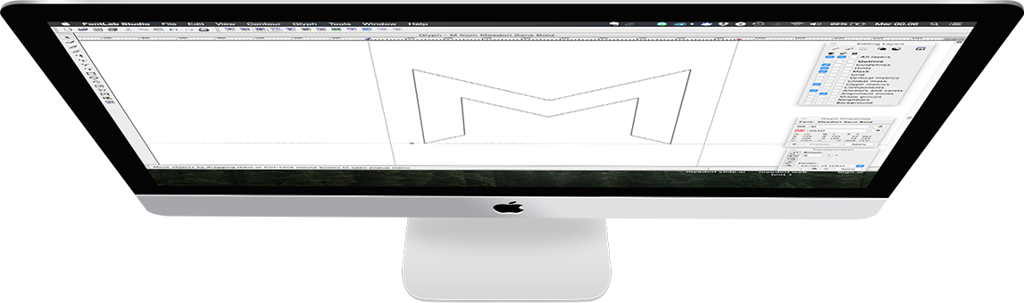
Designed in 2015 by Danilo De Marco for Meedori digital Studio, this font arose from the need to create a logotype that conformed with the visual identity of the company brand. Meedori Sans is a geometric font because its construction is inspired by the elementary shapes of geometry – circles, squares and triangles. It was created with the idea of conveying simplicity, linearity and modernism.
Meedori Sans is a font composed only of capital letters. The difference between capital and lowercase letters is in the cuts and diagonals inspired by the corporate brand. It is thus easy to combine them with each other to obtain an original combination of uniform characters. Inspiration.
Meedori Sans endeavors to create a modern impression. It is inspired by the font Futura by Paul Renner, designed in 1937, while the idea is rooted in the ideology of designers and architects such as Van De Rohe and schools such as Bauhaus.


Meedori Sans has searched a modern imprint. It is inspired by the font Futura by Paul Renner, designed in 1937, while the idea is rooted in the ideology belonging to designers and architects such as Van De Rohe and schools such as the Bauhaus.

The composition of the letters illustrates the different methods of work used in Meedori Studio. The letter A, for instance, is inspired by the compass, an instrument referring to the graphics of the past.

Following the style of studio digital now predominant in modern graphics, the letter E takes inspiration from the “Burger” icon seen on the interfaces of many applications and websites.